Playhead

Playhead is a media app that features everything from music to podcasts and movies. Its target user base is young people 18-24 who are tech savvy, on a budget and frequently consume media. The main goal was to improve premium subscription sign ups.
Background
Discover
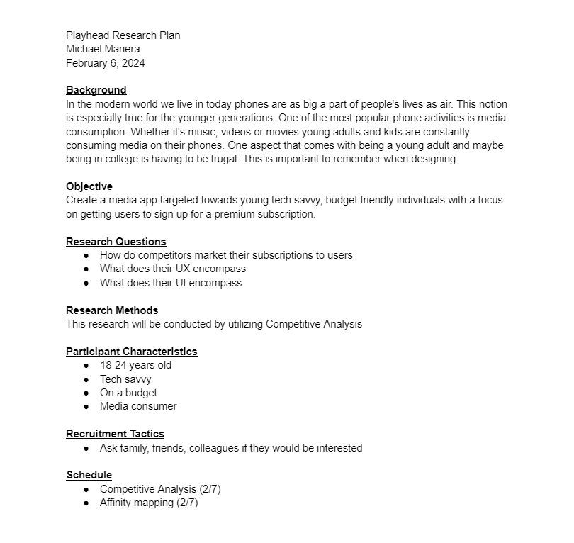
The first step on this project was writing a research plan. Explaining the background, the objective, the user and how and when you will complete your research. This helps to keep you on track. Having the research helps to understand the user your designing for.
Research Plan
Competitive Analysis
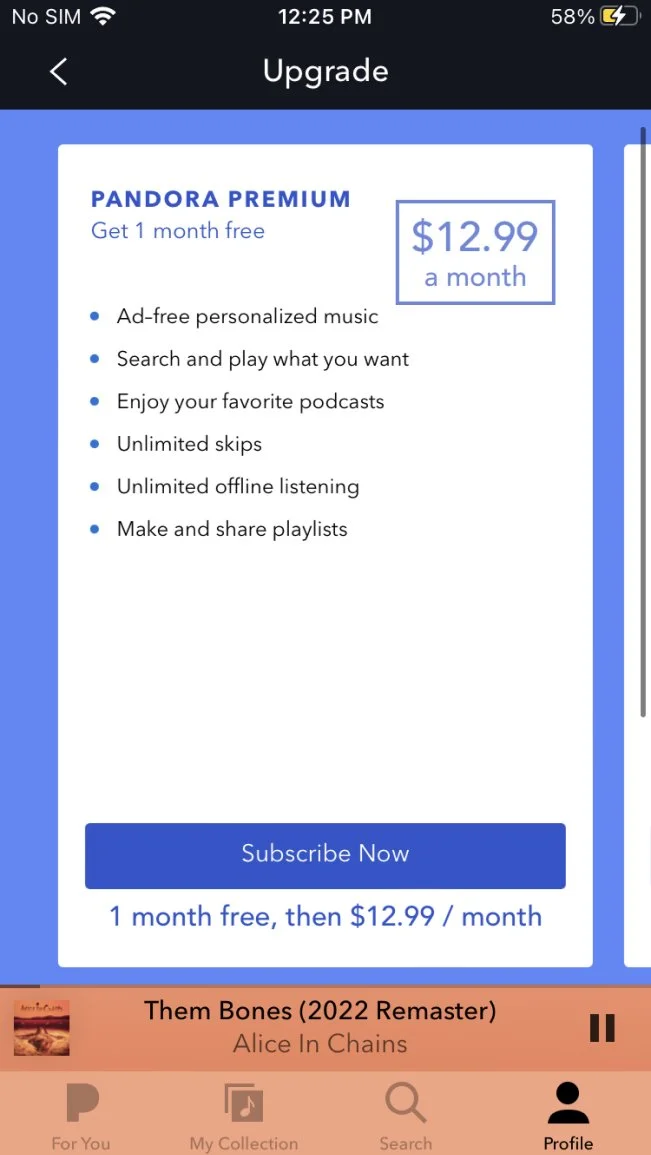
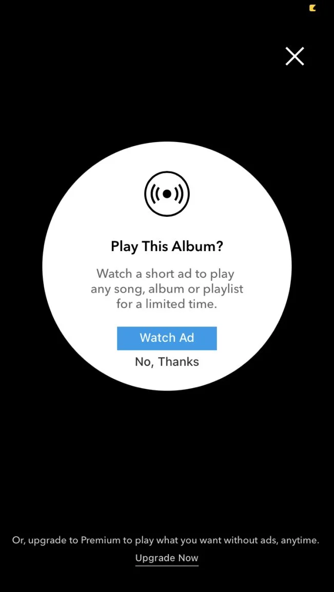
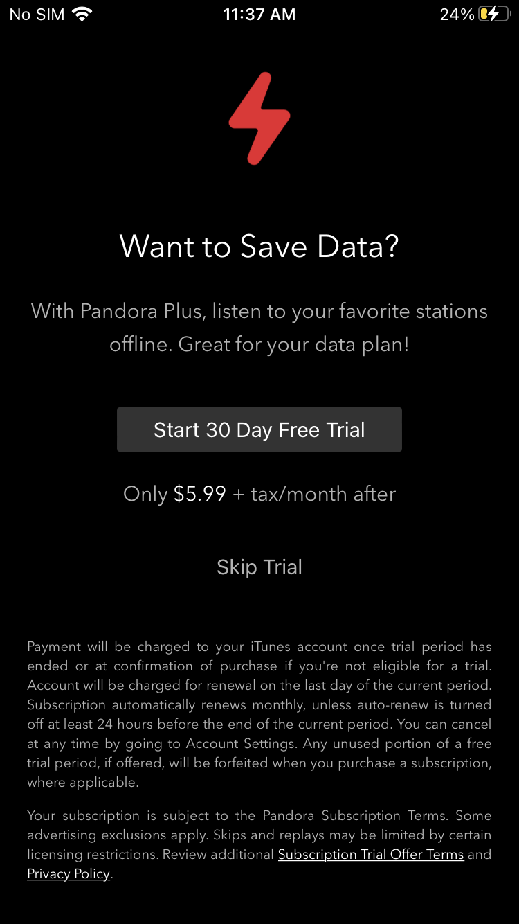
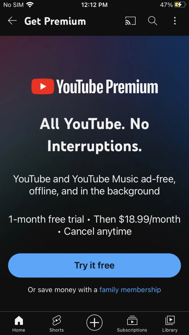
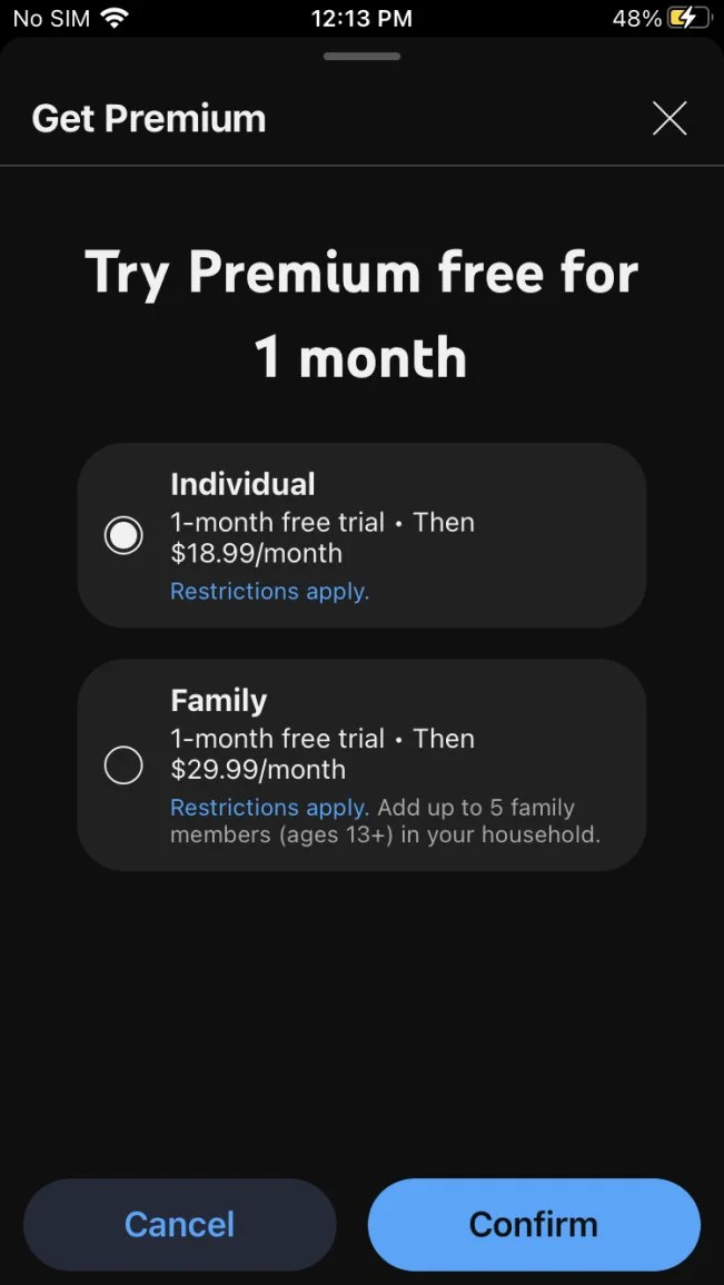
I chose to use competitive analysis for this project. I felt this method would help me understand best practices and common UI/UX patterns. I examined the big apps in this arena, Spotify, YouTube and Pandora.
Spotify
Good: They don’t bombard you with subscribing
Bad: The layout seems a little cluttered
Pandora
Good: UI is clean not overly complicated
Good: Easy to read and understand
YouTube
Good: Their choice of words is more enticing. They use “cancel anytime”
Good: Premium option is hidden in a sidebar menu
Research Synthesis
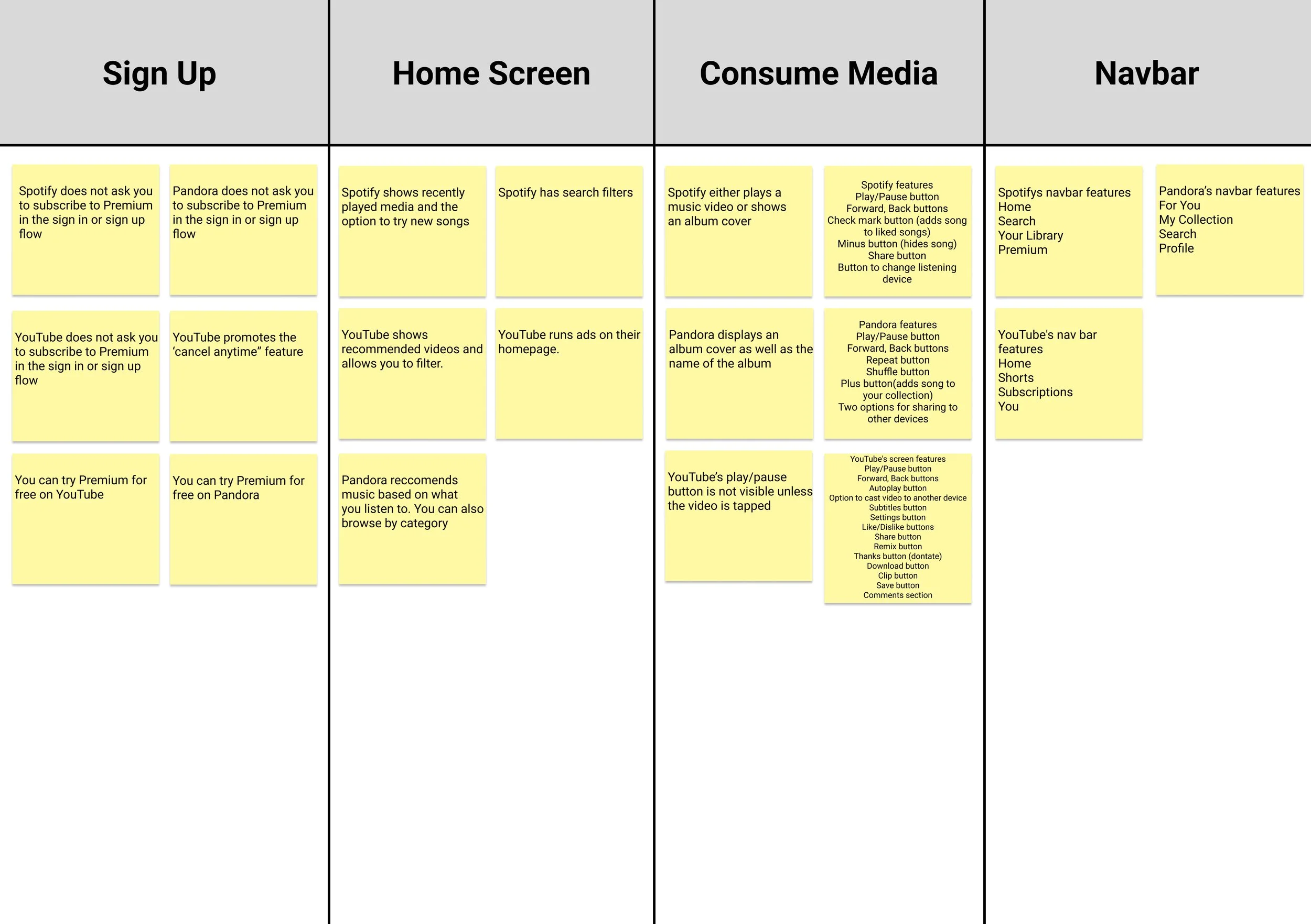
I then took the information I gathered from my competitive analysis and entered it in an affinity map. This allows me to see the similarities and differences between each app broken down by feature.
Design & Validate
User Flows
For this design I created three user flows. The first flow is the sign in or sign up flow. This helps to illustrate the steps a new or returning user would take when opening the app.
Legend
Sign In / Sign Up Flow
Primary Subscription Flow
Secondary Subscription Flow
The second user flow is two parts, a primary and a secondary flow. The primary flow shows how a user would deal with a subscription pop up. The secondary flow shows how a user would subscribe to premium if they were looking for it in the app.
Low Fidelity
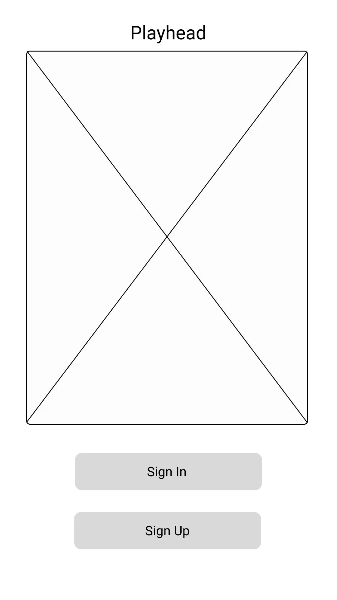
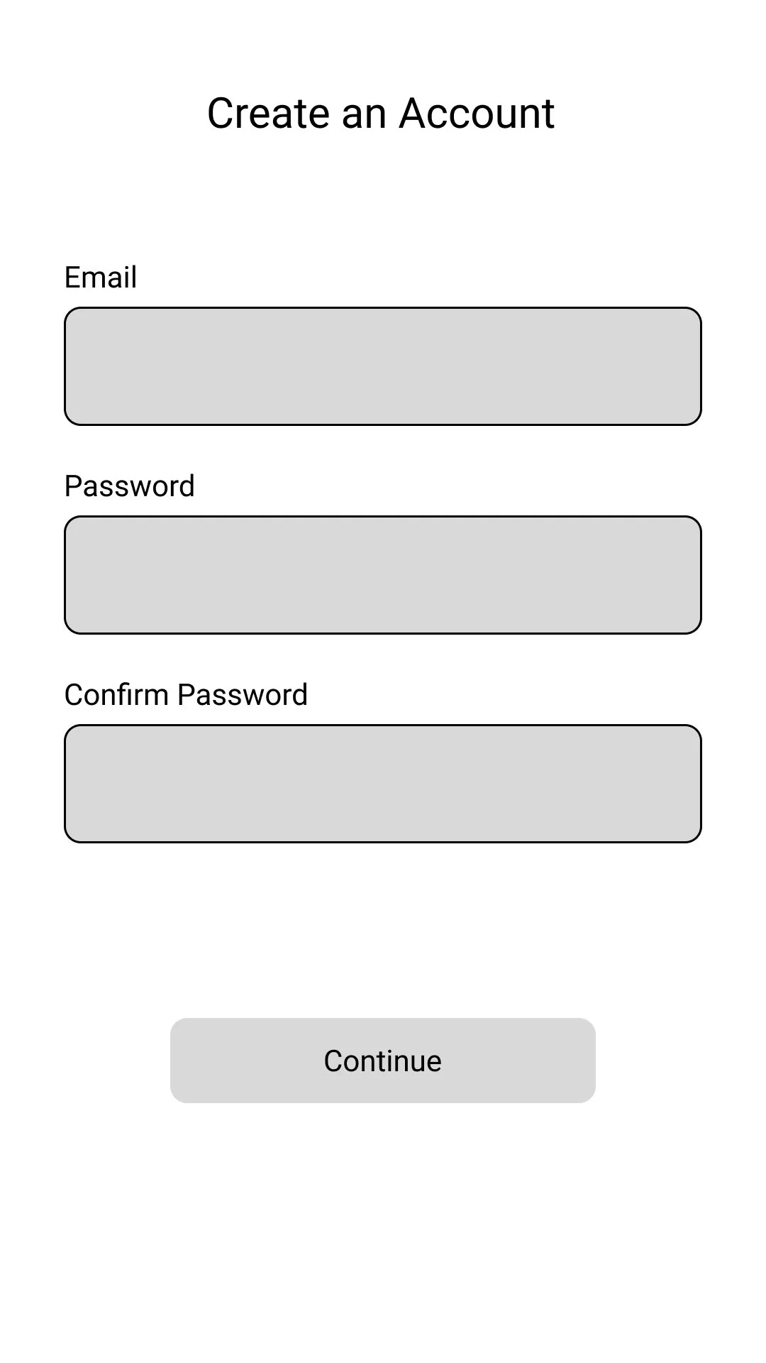
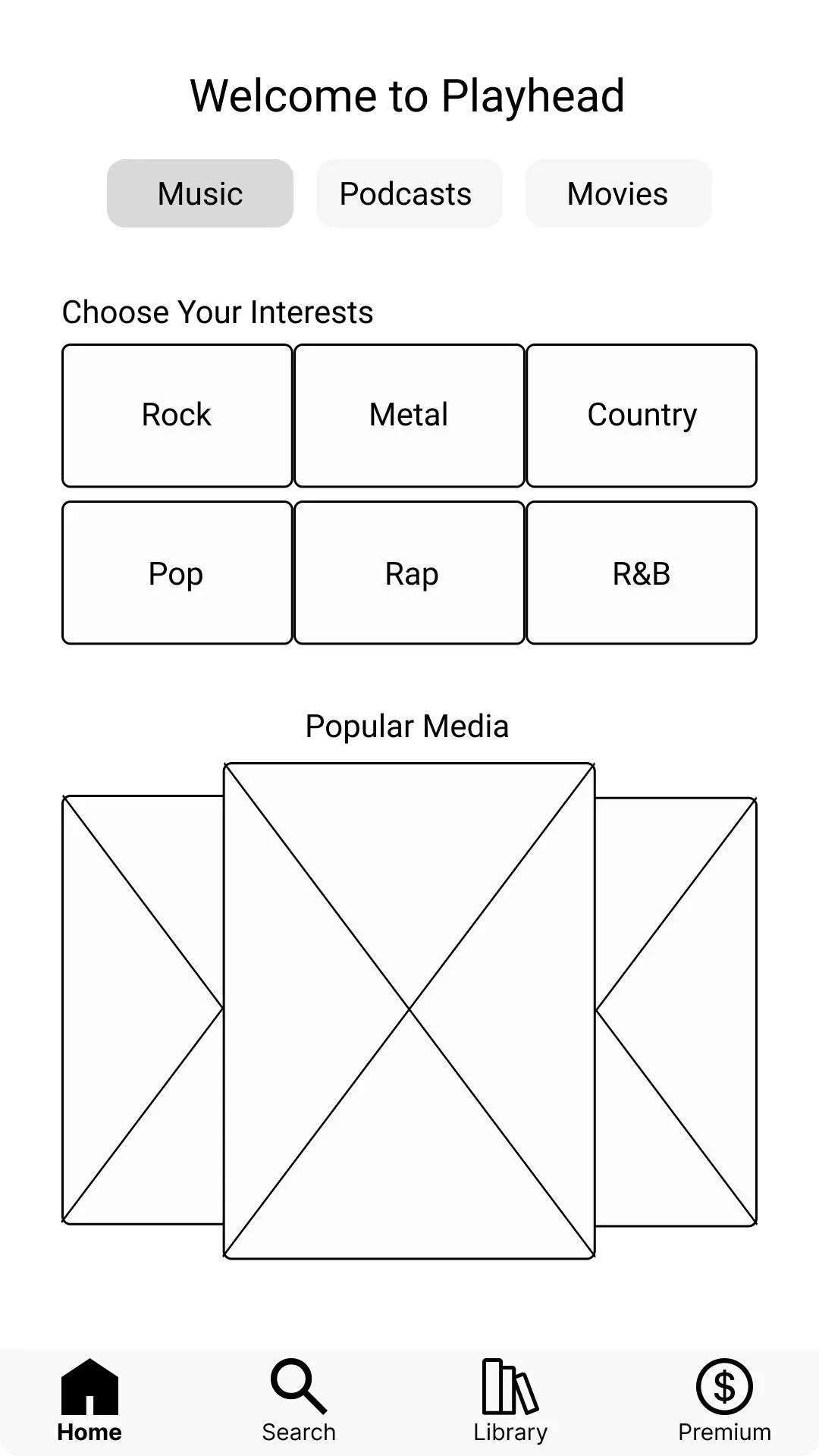
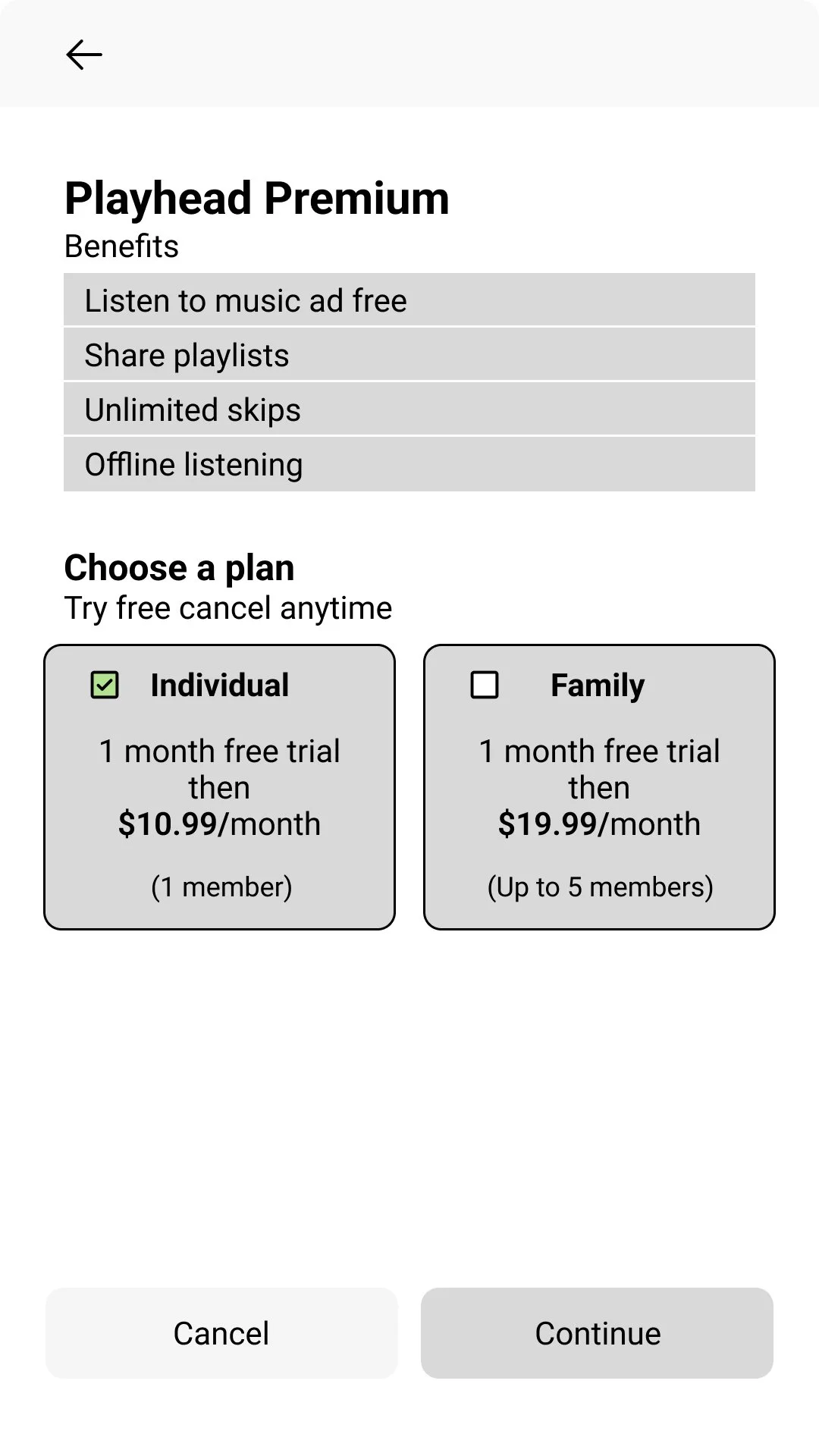
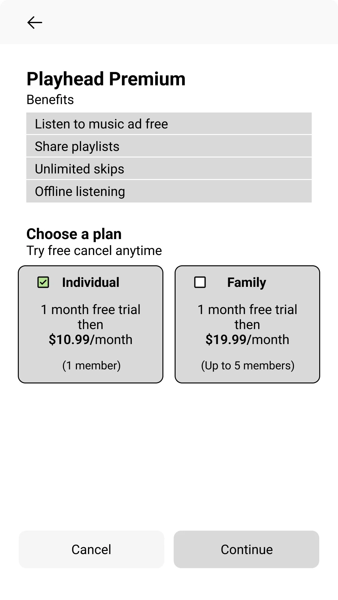
I created my low fidelity designs using Figma. I could have sketched my designs. However I feel that using design software gives the user a better idea of what the app will look like when testing. I chose to focus solely on the music side of the app due to time constraints.
Sign In / Sign Up Flow
Primary Subscription Flow
Secondary Subscription Flow
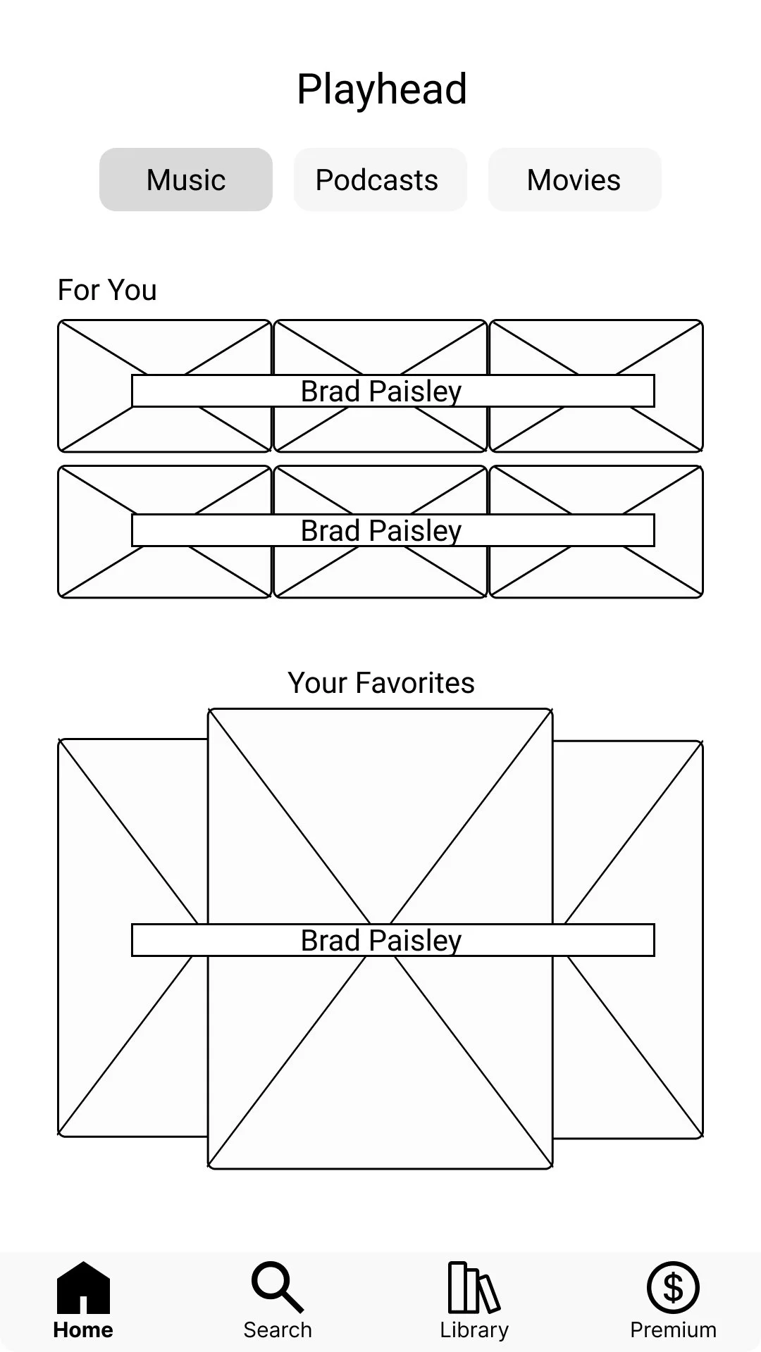
Returning User Home Screen
High Fidelity Testing
In this round of testing I received similar results to the first round of testing. The users navigated through the flows fairly smoothly.
Sign Up Flow: The user was tasked with signing up. I found that everyone navigated this flow well. There were a few people who momentarily contemplated between sign in or sign up.
Subscription Flow: The user is tasked with navigating a subscription pop up on the media player screen. Each user chose to investigate the plan information. I prompted almost everyone to do so except for one user. The user still chose to investigate the plan however.
Subscription Flow 2: The user is tasked with finding premium information in another spot in the app. Some users took a second to find “account” others found it right away. On the account page they found the premium button with ease.
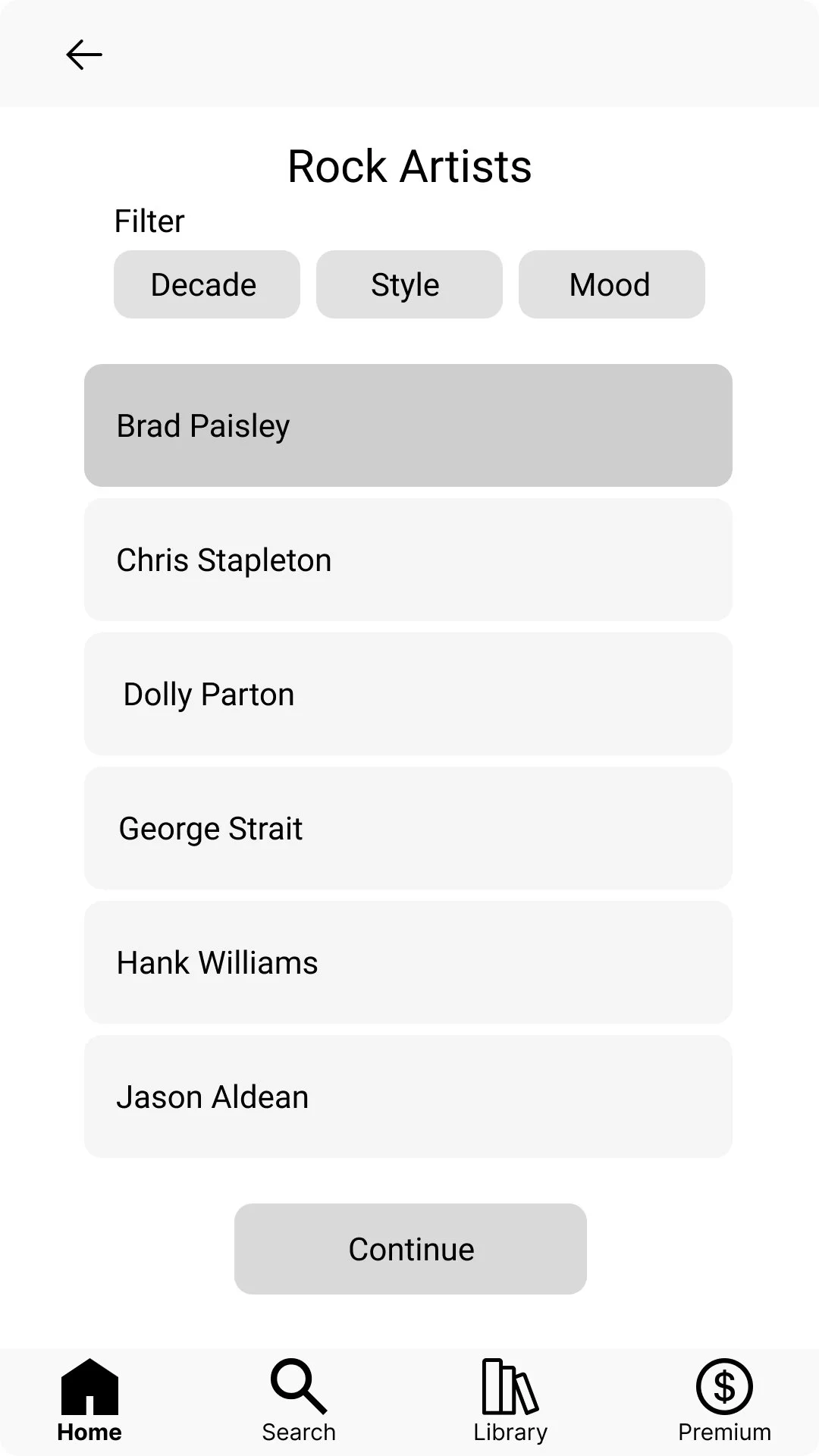
Customization Flow: Back on the home screen the user is told in this scenario they like country music and are asked for their next move. Everyone seemed to find the country tab with no issue. On the country music screen I told them they are interested in Brad Paisley, each user found Brad Paisley with no issue.
The users navigated most flows with ease. The difficulty seemed to come up when prompted to find information about premium another way. These results seemed to be 50/50. Some users found the “account” option with ease. Some contemplated. When it came to the customization flow people the order of operations to be easy. Ultimately the testing went well. However I am not sure most users are even interested in a “premium” account.
High Fidelity
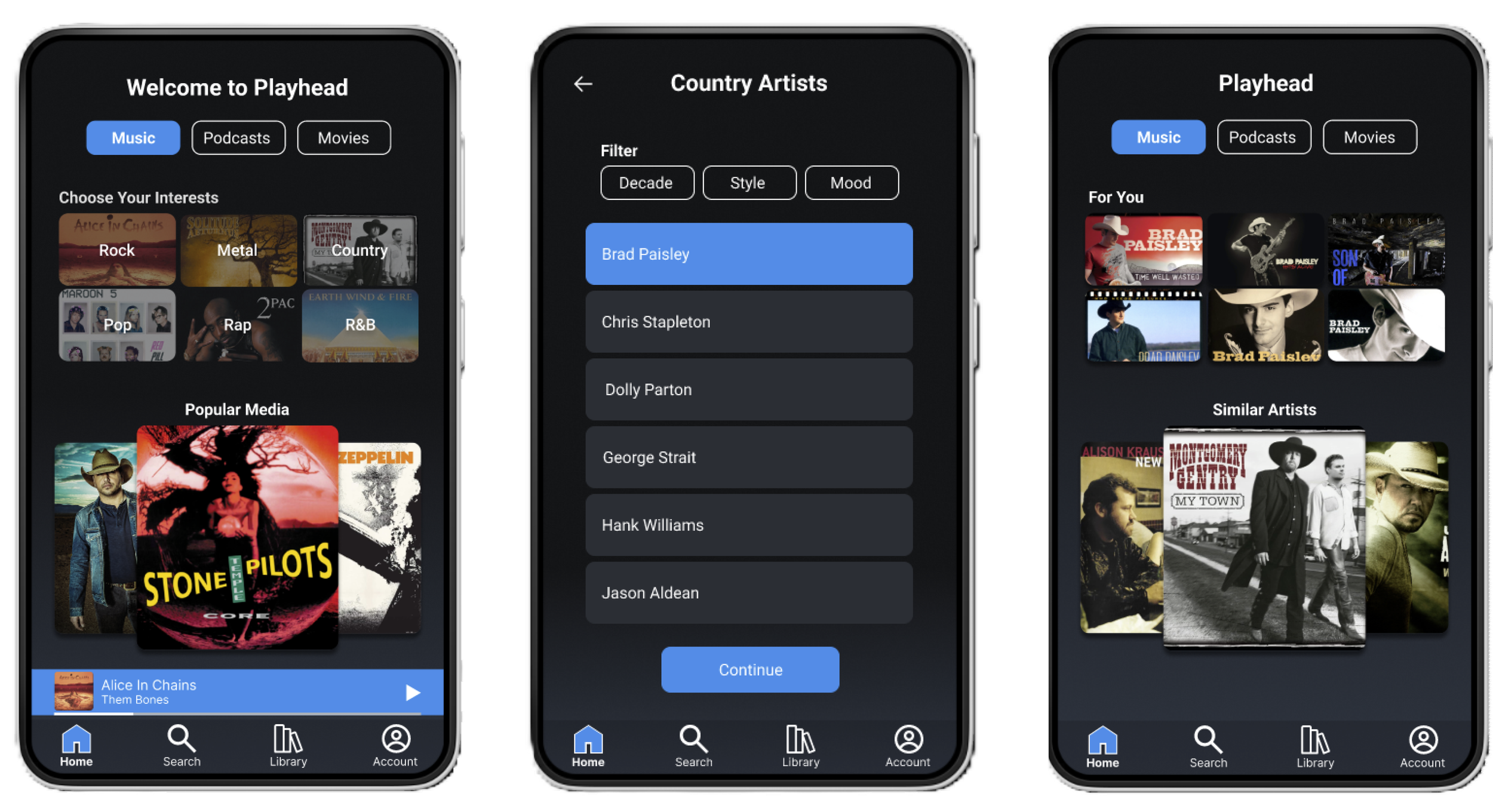
My high fidelity screens closely resembled my wireframes. Early testing allowed me to move to high fidelity without many iterations I chose a dark theme approach because of its popularity and familiarity.
New User Sign Up flow
Primary Subscription Flow
Secondary Subscription Flow
Customization Flow
Testing and Findings
The user testing went fairly smooth sailing. I presented the participants with four different flows.
Sign Up Flow: The user was tasked with signing up. I found that everyone navigated this flow with no issues
Subscription Flow: The user is placed on the media player screen and met with a subscription pop up. The user is then prompted to investigate the pop up. Each person seemed to navigate through the plan information and billing without issue.
Subscription Flow 2: The user is placed on the home screen and asked to find another location for premium plan information. The results were mixed on this flow. Some users found the account option with ease, while others took a moment to find it. On the account page most users found the premium button with no issues.
Customization Flow: The user is placed on the home screen. I present them with a scenario that they are interested in country music. I ask what their next move would be. Each user chose the country music tab. I then prompt them to chose Brad Paisley when the screen asks for their favorite artists. They navigated through with no problems.
The user flows performed well in this round of user testing. I am happy with the way the users navigated the app. My high fidelity screens almost exactly mimic my wireframes. I did not have to make many changes between the two. The users seemed to understand how this type of app is supposed to work. They navigated fairly smoothly.
Conclusion
The Playhead media app set out to accomplish a set of goals. The app accomplished those goals and more. Even though the project was supposed to be for one age group and type of person. I found that people inside and outside of that group navigated the app with ease. This is because I took the time to evaluate how the industry standard apps operate, look and feel. Doing this allowed me to create an app that has features people are accustomed to.
The user chooses a song to play. A pop up appears. They choose to investigate by tapping “plan information”
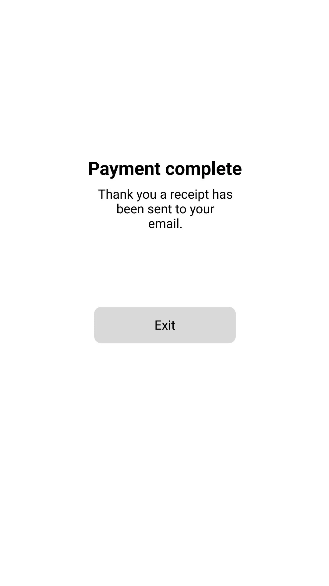
The user is taken to the payment complete screen and upon tapping “exit” returns to the media player
The user chooses Sign Up
The user chooses Brad Paisley
The user is taken to the payment complete screen and upon tapping ”exit” returns to the home screen
The new home screen displays Brad Paisleys work
The user enters the required
information and upon review
taps pay
The user chooses “Premium” from the nav bar
The user decides to
choose the “individual” plan
The user enters the required
information and upon review
taps pay
The user filters by music and
chooses country.
The user decides to
choose the “individual” plan
The user enters info and taps
continue
The user is on the home screen
